Visualization and Interactive Mapping
Lesson Goals
- Explore a sampling of interactive mapping libraries in R
R is fantastic for making high-quality publication quality static maps, and for generating repetitive graphics through scripts, and we’ve scattered the use of base plotting and using ggplot for making maps through exercises so far. There are also a number of packages now in R that link R code to plotting libraries developed in Javascript (or other languages) for interactive plotting and web integration, and we’ll take a brief look here.
ggplot2
We’ve already been using ggplot throughout the workshop, but let’s revisit making a basic ggplot map and then explore the plotly package and it’s integration with ggplot.
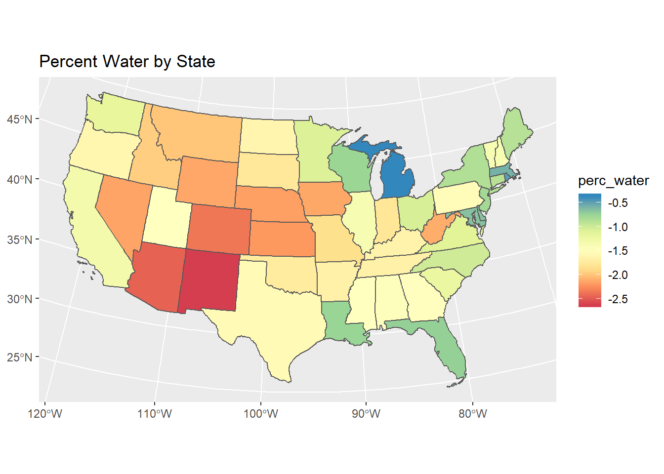
Below we pull in US states as an sf object using the USAboundaries package (notice packages are quickly moving to the sf framework). We then use dplyr to filter just CONUS states and create a new ‘perc_water’ variable, and then make a static ggplot map.
# create sf object for states, estimate and add area
library(USAboundaries)
library(dplyr)
library(sf)
library(ggplot2)
states <- us_states()
states <- states %>%
  dplyr::filter(!name %in% c('Alaska','Hawaii', 'Puerto Rico')) %>%
  dplyr::mutate(perc_water = log10((awater)/(awater + aland)))
# Transform to Albers for making map of US
states <- st_transform(states, 5070)
# plot with ggplot
ggplot(states) +
  geom_sf(aes(fill = perc_water)) +
  scale_fill_distiller("perc_water",palette = "Spectral", direction = 1) +
  ggtitle("Percent Water by State")
Plotly and ggplotly
Now that we’ve shown a nice static map of a mocked-up variable for CONUS using ggplot2, we’ll useplotly and make an interactive map directly with our sf states object - take a minute to explore the interactive map created and tools in the menu bar (click the zoom button or view in browser button in your viewer pane in RStudio):
This makes a basic interactive map; next we’ll add a few arguments:
splitdefines a grouping variable using a column in the input data, without this the color wan’t map to anything and it also defines what we see on mouse-overcoloridentifies the column in the data to mapshowlegendcan toggle the legend for the splitting variable, here we don’t need italphasets the transparency of the polygons, we don’t see the polygon borders if we set the transparency as completely opaque
Take a minute to look over the maps section of the plotly cookbook and try some of the ideas there - basic example below using ggplotly with ggplot and geom_sf layer - note that you may need to click the ‘show in new window’ button in viewer tab for the plotly map to show up.
Leaflet
Leaflet is an extremely popular open-source javascript library for interactive web mapping, and the leaflet R package allows R users to create Leaflet maps from R. Leaflet can plot sf or sp objects, or x / y coordinates, and can plot points, lines or polygons. There are a number of base layers you can choose from. It’s worth spending some time exploring the excellent Leaflet for R site.
Here we make the simplest of leaflet maps:
Mapview
Mapview is a package designed for quick and easy interactive visualizations of spatial data - it makes use of leaflet but simplifies mapping functions compared to the leaflet package. Both are handy, but similar enough that we’ll focus on additional plotting of spatial data on basemaps using mapview rather than leaflet.
mapview directly supports using sf, sp, and raster objects. Let’s return to some of the previous data we used and view using mapview - if you don’t still have the ‘stations_sf’ data frame loaded in your environment, reload using the steps in DataRetrieval section of previous workshop section.
## Reading layer `stations' from data source `F:\GitProjects\R-User-Group-Spatial-Workshop-2018\data\stations.shp' using driver `ESRI Shapefile'
## Simple feature collection with 31 features and 11 fields
## geometry type:  POINT
## dimension:      XY
## bbox:           xmin: -78.97808 ymin: 35.87222 xmax: -78.74945 ymax: 36.18278
## epsg (SRID):    NA
## proj4string: +proj=longlat +ellps=GRS80 +no_defsIt’s easy to layer features with mapview - you can supply a list of objects to mapview or use + syntax as with ggplot - here we’ll add a layer for the watershed we used previously:
## Reading layer `Third_Fork' from data source `F:\GitProjects\R-User-Group-Spatial-Workshop-2018\data\Third_Fork.shp' using driver `ESRI Shapefile'
## Simple feature collection with 1 feature and 21 fields
## geometry type:  POLYGON
## dimension:      XY
## bbox:           xmin: -78.96945 ymin: 35.90316 xmax: -78.86583 ymax: 35.99798
## epsg (SRID):    4269
## proj4string: +proj=longlat +datum=NAD83 +no_defsQuick Exercise Glance through the mapview basics and adjust legend and attributes. Take a look at mapview advanced controls as well and try plotting stations and watershed together again with black outline and transparent fill with the watershed.
Let’s plot some raster data as well and then explore cool features like sync, lattice view and swipe in mapview- we’ll again recycle some raster data from previous exercise, if not loaded in environment anymore go to SpatialOperations1 or SpatialOperations2 where we loaded sample raster data and run code to pull rasters in:
library(raster)
NED <- raster('data/NED.tif')
mapview(stations_sf) + mapview(ThirdFork, alpha.regions=0) + NED
Notice how we controlled transparency in order to plot the elevation raster and watershed together - and notice how in the map we can toggle our layers on and off, as well as change our base maps.
QuickExercise Try plotting separately or together any other of the data we’ve looked at with mapview, or bring in some additional raster data layers with the FedData package and load in mapview
Sync, lattice, swipe - first we’ll sync two maps of our gage stations and NHD flowlines - try adding a third or fourth sync layer if you want:
## Reading layer `NHD_ThirdFork' from data source `F:\GitProjects\R-User-Group-Spatial-Workshop-2018\data\NHD_ThirdFork.shp' using driver `ESRI Shapefile'
## Simple feature collection with 134 features and 16 fields
## geometry type:  LINESTRING
## dimension:      XY
## bbox:           xmin: -78.9694 ymin: 35.90328 xmax: -78.87323 ymax: 35.99151
## epsg (SRID):    4269
## proj4string: +proj=longlat +datum=NAD83 +no_defslatticeView will render small multiples without synchronizing the views:
slideView is same functionality as map slider in ArcGIS, seamlessly integrated into R - here we’ll try with two of the raster layers pulled down using FedData - this code should work for you, however the slider does not show properly on GitHub pages so I’m not showing the result below:
micromap and tmap
If time allows, let’s take a quick look at a couple packages for exploratory spatial data analysis, the micromap package and the tmap package.
tmap is a newer R package for creating thematic maps based on the grammar of graphics (gg) approach used with ggplot2. An article was recently published in the Journal of Statistical Software that describes the package in detail, the the GitHub repository has a wealth of vignettes, tutorials, resources, and links to examples from the JSS article.
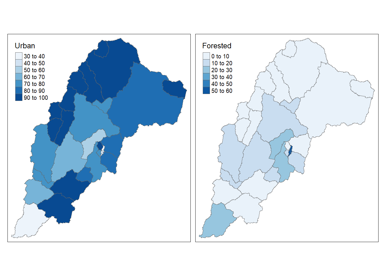
So let’s take our NLCD data summarized to NHDPLus catchments for the Third Fork watershed and generate a simple choropleth map - we’ll need to join our results from NLCD summarization to the catchments, and then we can aggregate a NLCD categories for display:
library(tmap)
library(dplyr)
# First we need to tie our results of summarizing
# land cover for catchments to our catchment shapefile
# make our 'join' attribute names match - you can use 'rename' for this, I prefer indexing names of data frame
# if nlcd_stats file and Catchments files not still in memory:
nlcd_stats <- read.csv('data/nlcd_stats.csv')
Catchments <- st_read('data/Third_ForkCats.shp')
## Reading layer `Third_ForkCats' from data source `F:\GitProjects\R-User-Group-Spatial-Workshop-2018\data\Third_ForkCats.shp' using driver `ESRI Shapefile'
## Simple feature collection with 28 features and 4 fields
## geometry type: MULTIPOLYGON
## dimension: XY
## bbox: xmin: -78.96955 ymin: 35.90293 xmax: -78.86599 ymax: 35.99817
## epsg (SRID): 4269
## proj4string: +proj=longlat +datum=NAD83 +no_defsnames(nlcd_stats)[1] <- 'FEATUREID'
Catchments <- left_join(Catchments, nlcd_stats, by='FEATUREID')
Cat_NLCD<- Catchments %>%
mutate(Urban = (Dev.OS + Dev.LI + Dev.MI + Dev.HI),
Forested = (Dec.For + Ev.For +Mix.For))
# Cat_NLCD<- Catchments %>%
# mutate(Urban = (`Dev OS` + `Dev LI` +`Dev MI` +`Dev HI`),
# Forested = (`Dec For` +`Ev For` +`Mix For`))
qtm(shp = Cat_NLCD, fill = c("Urban", "Forested"), fill.palette = c("Blues"), ncol = 2)
That a nice informative map with just a couple lines of code!
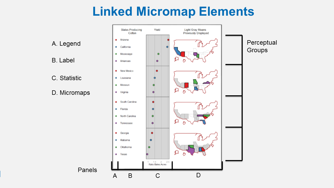
We can do even more with a linked micromap using the micromap package that Mike and I helped write. A linked micromap is a graphic that simultaneously summarizes and displays statistical and geographic distributions by a color-coded link between statistical summaries of polygons to a series of small maps. The package is described in full in an article published in the Journal of Statistical Software. This figure shows the four elements of a linked micromap.

Linked Micromap Elements
A recent study by McManus et al. (2016) used linked micromaps to summarize water quality data collected from a spatially balanced, probabilistic stream survey of 25 watersheds done by West Virginia Department of Environmental Protection. That visualization led to a multivariate spatial analysis based on the contiguity of the watersheds, which was based on work done in R by Dray and Jombart (2011) and [Dray et al. (2012)](https://esajournals.onlinelibrary.wiley.com/doi/abs/10.1890/11-1183.1.
The dataset was created by summarizing watershed land use from NLCD data and appending the information to a shapefile of waterbody IDs. We’ll do the same thing with our sample data. micromap currently does not work with sf objects, though I have a development branch I’ve almost finished updating to use sf, so we’ll convert our data to a SpatialPolygonsDataFrame object using the as(, Spatial) function from the sf package.
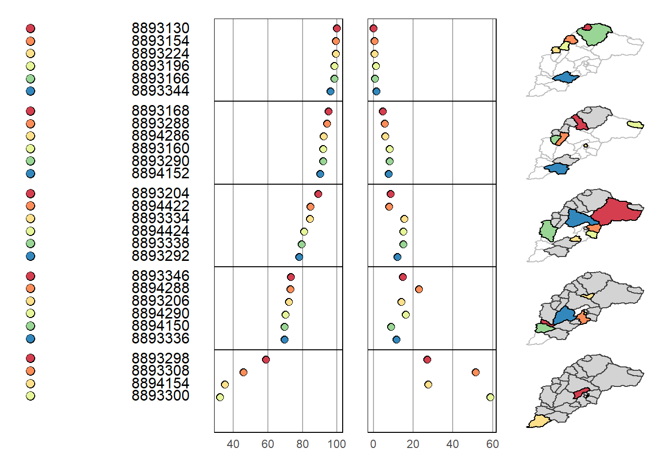
The minimal requirements to create a micromap are defined using these arguments for the mmplot function:
map.dataThe input data object.panel.typesThe types of panels to include in the micromap.panel.dataThe data (columns) inmap.datato use for each panel type. The rest of the arguments below are optional. These define which variable the plot is sorted by (ord.by), if the axes are flipped (rev.ord), how many observations are in each perceptual group (grouping), and whether or not to include a median row (median.row).
library(micromap)
Cat_NLCD_sp <- as(Cat_NLCD,'Spatial')
mmplot(map.data = Cat_NLCD_sp,
  panel.types = c('dot_legend', 'labels', 'dot', 'dot', 'map'),
  panel.data=list(NA,'FEATUREID','Urban', 'Forested',NA),
  ord.by = 'Urban',
  rev.ord = TRUE,
  grouping = 6,
  median.row = FALSE)
We see a similar story but with much denser information content in our linked micromap. There are numerous options for linked micromaps worth exploring - see example using Mike McManus’ data in R Spatial Course by Ryan Hill and Marcus Beck at SFS.